If you run a business that makes or sells electric motors, you know the competition is tough. Customers have many choices. They need a reason to pick you. That reason often starts with your brand. And at the very heart of your brand is your electrical motor logo.
This isn't just a pretty picture. For an engineering-driven industry, your logo is a promise. It communicates precision, reliability, power, and innovation before a single spec sheet is read. A strong electrical motor logo builds immediate trust with engineers, procurement managers, and facility operators.
Let's talk about how to create one that works.
Why Your Electrical Motor Logo Needs a Different Approach
Designing a logo for an electric motor company isn't like designing one for a cafe or a clothing brand. The audience is different. The emotions you want to evoke are different.
You're not selling a lifestyle. You're selling a critical component. Your electrical motor logo must speak to technical competency, durability, and efficiency. It needs to look at home on a motor nameplate, a technical datasheet, and a trade show banner. It must resonate with professionals who value substance over flash.
A weak or generic logo can subtly suggest a weak or generic product. In this sector, your logo is often the first visual cue of your company's engineering philosophy.
Core Elements of a Powerful Motor Brand Identity
A memorable and effective electrical motor logo often blends a few key elements. It’s the combination that creates something unique and ownable.
The symbol, or icon, is the graphic centerpiece. For motor brands, this often abstracts concepts like motion, energy, magnetism, or precision engineering. The company name is displayed in a strong, custom typeface. The right font weight and style are crucial.
Often, a tagline or a founding year is included to convey heritage or specialization. The color palette is chosen for its psychological impact and industrial appropriateness. These elements must work in harmony to solidify your motor branding.
Choosing the Right Visual Language: Literal vs. Abstract
One of the first decisions is how directly your electrical motor logo should represent a motor. There are two main paths.
A literal approach might use a stylized depiction of a motor coil, a rotor, or a gear. This is clear and immediately communicates your industry. The risk is appearing too generic or old-fashioned if not executed with exceptional skill.
An abstract approach uses shapes, lines, and forms to suggest concepts like efficiency, motion, or electromagnetic fields. Think of arcs implying rotation, interconnected lines suggesting circuitry, or sleek forms hinting at innovation. This path can feel more modern and distinctive, allowing your brand to stand out in a crowded electrical motor logo landscape.
Many successful brands find a middle ground. They use an abstract mark that subtly hints at a technical form, supported by a bold, no-nonsense company name.
The Psychology of Color in Motor Industry Logos
Color is a silent salesman. For an electrical motor logo, color choices are loaded with meaning. Your palette must align with your brand's personality.
Blue is the dominant color in this field. It conveys trust, reliability, calm, and technology. Darker blues suggest solidity and professionalism, while brighter blues can imply innovation and efficiency.
Green is strongly associated with energy efficiency, eco-friendly motors, and sustainability. It’s a powerful choice if your product line focuses on reduced environmental impact. Red can signify power, action, and passion. It’s often used as an accent color to draw attention to a specific element or to signify a premium or high-performance line.
Neutrals like black, gray, and silver are mainstays. They communicate precision, engineering excellence, strength, and a no-nonsense attitude. They are classic and work well for established manufacturers. A sophisticated electrical motor logo often uses a primary color (like blue) with a neutral (like gray or silver) for a balanced, professional look.
Typography That Communicates Strength and Precision
The font you choose for your company name is just as important as the icon. The typography in your electrical motor logo sends a clear message.
Serif fonts, with their small finishing strokes, can convey tradition, reliability, and established heritage. They can sometimes feel a bit more conservative. Sans-serif fonts are the most common choice for modern industrial brands. They communicate cleanliness, efficiency, modernity, and straightforwardness. A bold, heavy sans-serif font feels solid and powerful.
The key is legibility and distinctiveness. Your wordmark must be perfectly readable when scaled down on a small nameplate or scaled up on a warehouse wall. Avoid overly decorative or thin fonts. Customizing a standard font with a unique tweak can help you own your typographic look.
Practical Considerations: Where Your Logo Must Work
A great electrical motor logo isn't just for your website header. It needs to perform in real-world industrial environments.
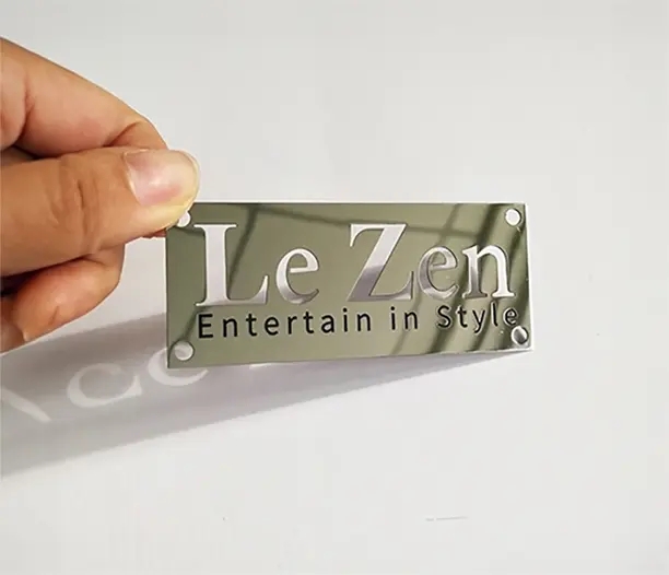
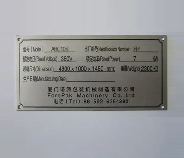
It must be legible when etched, stamped, or printed onto a metal motor nameplate. This requires a design that works in a single color. It needs to look good on product labels, packaging, and shipping crates. It should be effective on technical documentation, brochures, and sales sheets.
Your logo must be adaptable for digital use: your website, social media profiles, and email signatures. It should also work for large-scale applications like signage on your factory building or trade show displays. A versatile logo system, with approved horizontal, stacked, and icon-only versions, is essential for consistent motor branding across all touchpoints.
The Design Process: From Concept to Nameplate
Creating a professional electrical motor logo is a process, not a single event. Rushing it leads to a generic result.
It starts with a deep discovery phase. What are your company's core values? Who is your target customer? What makes your motors different? This brief becomes the roadmap. Next comes research and brainstorming. Look at competitors' logos—not to copy, but to understand the landscape and find a gap.
Then, sketching begins. Dozens, even hundreds, of rough ideas on paper. This is where the best concepts are born. After selecting a few strong directions, they are refined digitally. Color palettes and typography are explored in detail.
The top concepts are then tested in practical applications: on a mock motor, a business card, a website header. This reveals any weaknesses. Finally, you receive a complete brand style guide. This document ensures your new electrical motor logo is used correctly everywhere, protecting your investment.
Common Pitfalls to Avoid in Motor Logo Design
Knowing what not to do is half the battle. Here are some frequent missteps we see.
Using overly complex clip-art style motor graphics. They look dated and amateurish. Choosing a color palette that looks vibrant on screen but fails in monochrome etching or faded on a sun-exposed sign. Selecting a trendy font that will feel outdated in five years. Motor brands benefit from timelessness.
Creating a logo that is too horizontal or too vertical, making it difficult to fit into standard marketing materials or nameplate dimensions. Neglecting to secure the legal rights to your logo, which can lead to costly disputes down the line. Your electrical motor logo must be uniquely yours.
Investing in Your Brand's Long-Term Identity
Your electrical motor logo is a long-term asset. It’s the visual cornerstone of your company's identity. While it's tempting to try a quick, cheap design solution, this often leads to a logo that fails to connect and needs costly redesigns sooner rather than later.
A thoughtfully designed logo, created through a strategic process, pays for itself many times over. It builds recognition, conveys quality, and helps you win bids in a competitive global market. It becomes synonymous with performance and reliability.
In the world of electric motors, where the product is often hidden inside machinery, your logo is your public face. Make sure it’s a face that commands respect and inspires confidence. Make sure it’s a brand that truly moves—both your products and your customers.
Frequently Asked Questions (FAQ)
Q1: Should our new electrical motor logo definitely include a picture of a motor?
A1: Not necessarily. While a literal graphic can be clear, it can also limit your brand if you diversify your product line. An abstract symbol that suggests motion, precision, or energy can be more versatile and memorable. The best choice depends on your specific brand strategy and long-term vision.
Q2: What are the current trends in electrical motor logo design?
A2: Current trends lean towards simplification and boldness. There's a move away from overly detailed 3D effects towards flat, two-dimensional marks that are highly scalable. Many companies are also modernizing legacy logos by refining their icons, cleaning up typography, and updating color palettes to feel more contemporary while retaining brand equity.
Q3: Can we design our own electrical motor logo in-house to save money?
A3: You can attempt it, but professional design is strongly recommended. A professional designer brings expertise in visual communication, industry awareness, and the technical skill to create a versatile, legally sound logo file suite. An amateur logo can inadvertently communicate a lack of professionalism, which is risky in a technical field.
Q4: How often should we consider updating our electrical motor logo?
A4: A well-designed logo should last for 10-20 years without major changes. However, subtle refinements (like updating a font, simplifying a detail, or refreshing colors) might be considered every 10-15 years to keep the brand feeling current. A complete redesign is usually driven by a major shift in company direction, merger, or if the logo has become severely outdated.
Q5: What does a professional electrical motor logo design typically cost?
A5: Costs vary widely based on the designer's experience and the scope of work. A freelance designer might charge a few thousand dollars for a basic logo. A full branding project from an agency, which includes a logo, style guide, and application examples, can range from several thousand to tens of thousands. For a critical business asset, view this as a strategic investment, not just an expense.