We see them every day, often without a second thought. They are on our household cleaners, power tools, children's toys, and the medications in our cabinet. Safety warning labels are ubiquitous, and for a vital reason. They are a primary line of defense against injury, illness, and fatal accidents.
This article delves into the essential world of safety signs and warning labels, explaining why they matter, how they are designed, and the consequences of getting them wrong.

Why Safety Warning Labels Are Non-Negotiable
Safety warning labels serve three fundamental purposes. First, they alert users to potential hazards that may not be obvious. A chemical might look like water, but a warning label immediately communicates danger.
Second, they instruct on how to avoid the hazard. A good safety label doesn't just say "danger"; it says "danger of electric shock" and instructs to disconnect power before servicing.
Third, and crucially, they fulfill legal and moral obligations. Manufacturers have a "duty to warn" users about foreseeable risks. Proper product safety labels are a key component of risk management and liability prevention. They protect both the end-user and the company that made the product.
Decoding the Types: Signal Words and Their Meaning
Not all safety warning labels are created equal. They follow a hierarchy of hazard levels, typically communicated through standardized "signal words." Understanding this system is key to user comprehension.
DANGER: This signal word indicates an imminently hazardous situation which, if not avoided, will result in death or serious injury. It is reserved for the most severe risks. The background is usually red.
WARNING: This signifies a potentially hazardous situation which, if not avoided, could result in death or serious injury. It may also alert against unsafe practices. It represents an intermediate level of risk, often with an orange background.
CAUTION: This word warns against potential hazards or unsafe practices that, if not avoided, may result in minor or moderate injury. It can also be used to alert against property damage. It is commonly paired with a yellow background.
NOTICE: This word is used for important non-hazard related information regarding property damage, security, or product use. It is not for personal injury messages. The color blue is often associated with "Notice."
The Anatomy of an Effective Safety Label
An effective safety warning label is not a jumble of text. It's a carefully designed communication tool. Best practices and standards like ANSI Z535.4 in the U.S. outline a clear structure.
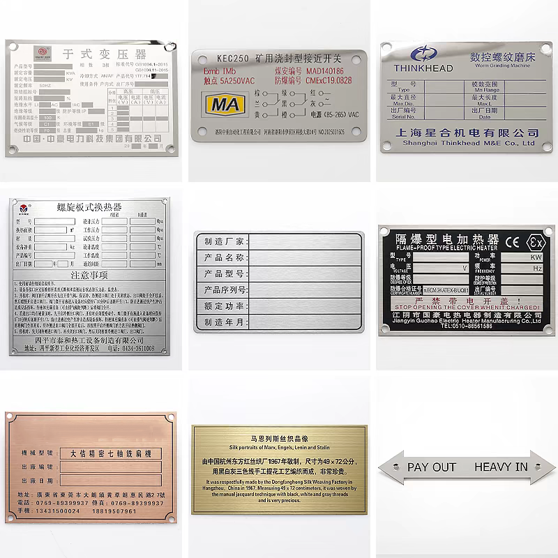
A high-impact warning label should include a clear signal word panel (Danger, Warning, Caution) in its associated color. It needs easily understood warning symbols or pictograms that convey the hazard type across language barriers.
The hazard statement must describe the nature of the hazard in simple, direct language. The consequences statement explains what could happen if the warning is ignored. Finally, instructional statements provide clear directions on how to avoid the hazard.
The use of safety symbols is critical. A lightning bolt for electrical risk, a flame for fire hazard, or a skull and crossbones for poison are universally recognized. These symbols transcend language and literacy barriers.
The High Stakes of Compliance and Standards
Safety warning labels are not merely a suggestion. They are often governed by a complex web of regulations and standards. These vary by industry, region, and product type.
Globally, systems like the Globally Harmonized System of Classification and Labelling of Chemicals (GHS) standardize hazard communication labels for chemical products. In the workplace, OSHA regulations in the U.S. mandate specific workplace safety labels for various hazards.
Failure to comply with these standards can result in severe penalties, including hefty fines, product recalls, and import/export bans. More importantly, non-compliant or missing safety labels can be the central evidence in devastating product liability lawsuits.
Common Pitfalls in Safety Label Design and Placement
Even with the best intentions, safety warnings can fail. One major pitfall is poor placement. A label must be positioned where it will be seen before the hazard is encountered, not hidden on an obscure part of the product.
Another error is using overly technical jargon that the average user will not understand. Language must be clear, concise, and written at an appropriate reading level. Warning labels that are too small, worn, damaged, or faded also lose their effectiveness.
Perhaps the most significant mistake is assuming a label is a substitute for safe design. The principle of "inherent safety" states that hazards should be designed out of a product whenever possible. Safety warning labels are for communicating residual risks that cannot be eliminated through design.

The Future of Hazard Communication
The field of safety warning labels is evolving. Technology is introducing new possibilities. QR codes on labels can link to multi-language instructions, detailed safety data sheets, or instructional videos.
Researchers are also exploring more intuitive and emotionally resonant warning symbols to improve comprehension rates. As products become more complex and global markets more interconnected, the clarity and universality of safety signs will only grow in importance.
The humble safety warning label is a testament to the principle that good communication saves lives. By understanding their design, purpose, and legal weight, manufacturers can create safer products, and users can make safer choices.
Frequently Asked Questions (FAQs) About Safety Warning Labels
Q1: What is the legal consequence of not having a proper safety warning label on a product?
A1: The legal consequences can be severe. Manufacturers can face regulatory fines from bodies like OSHA or the Consumer Product Safety Commission (CPSC). More critically, they can be held liable in civil lawsuits if an injury occurs due to an inadequate or missing safety warning label. This can result in costly settlements, jury verdicts, and irreparable damage to a brand's reputation.
Q2: How often should safety labels on equipment in a factory be inspected or replaced?
A2: Workplace safety labels should be included in regular facility inspections. They should be replaced immediately if they become faded, damaged, torn, or illegible. A good practice is to check labels during routine equipment maintenance schedules. Environmental factors like sunlight, chemicals, and abrasion can degrade labels over time.
Q3: What are the key differences between a "Danger" and a "Warning" label?
A3: The key difference lies in the probability and severity of the risk. "Danger" is used for the most extreme hazards where the risk is immediate and will result in serious injury or death if not avoided (e.g., high-voltage electrical panels). "Warning" indicates a hazardous situation that could result in serious injury or death, representing a significant but potentially less imminent risk (e.g., "Warning: Hot Surface").
Q4: Can a safety warning label protect a company from all liability if someone is injured?
A4: No, a safety warning label is not an absolute shield against liability. Its effectiveness is evaluated under the "adequacy" standard. Courts will assess if the warning was clear, conspicuous, and understandable, and if it accurately communicated the nature and severity of the hazard. A hidden, vague, or insufficiently alarming label may not provide legal protection.
Q5: Why are pictograms and symbols so important on safety labels?
A5: Safety symbols and pictograms are crucial for universal comprehension. They overcome language and literacy barriers, allowing individuals who speak different languages or have reading difficulties to understand the core hazard instantly. In a global marketplace and diverse workforce, this visual communication is an indispensable part of effective hazard communication.

